Pyramid Population Plots
Published:
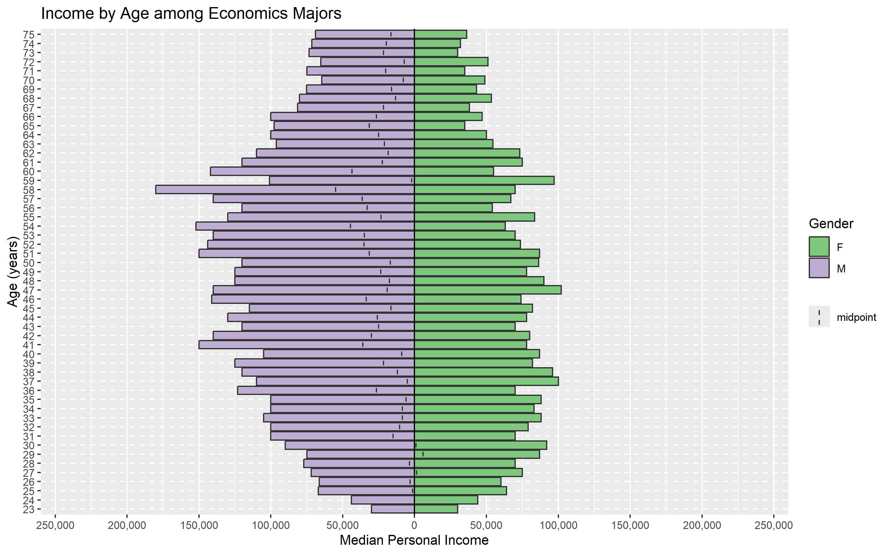
In this post, I continue a series of visualizations using IPUMS data about Economics Majors. Here we compare the median personal income by age for economics majors using the 2023 American Community Survey.
You will need an account on IPUMS to complete this project. In the code below, I provide a link to the data I am using in case you do not want to generate the data yourself.
We will be using the IPUMS online tool to obtain the data

Variables
- inctot = total personal income
- age = age in years
- sex = biological sex
- degfieldd(5501,6205) = degree field detail Economics(5501) and Business Economics (6205)
- year(2023) = year restricted to 2023
Select the “Median/Percentile Option” and select median.
You can then choose Run Table or select the option Create and Download CSV file, then Generate CSV, and download the file once the process is complete.
After downloading the data, you do need to do some data wrangling.
You want to create a new csv file where one column is age, another column is gender, and the last column is the value of interest, which we will name population for convenience but it can be anything you want.
# creates a population pyramid
# apyramid helps us make these graphs relatively easily
library(apyramid)
# ggplot2 helps us create the labels.
library(ggplot2)
# load sample data
means <- read.csv("https://prof-fernandez.github.io/files/means (1).csv")
# Your x variable must be a factor variable
means$age <- factor(means$age)
flup <- age_pyramid(means, age, split_by = gender, count = population)
flup +  labs(x = "Age (years)",y = "Median Personal Income", fill = "Gender",
             title = "Income by Age among Economics Majors")