Comparison of Means and GGPLOT
Published:
Understanding the RAND Health Insurance Experiment: A Brief Analysis
The RAND Health Insurance Experiment (HIE) is one of the most comprehensive studies ever conducted on the impact of health insurance on medical spending and health outcomes. Spanning from 1974 to 1982, it explored how different types of health insurance plans affected individuals’ healthcare usage and overall health.
In this post, we’ll dive into the basics of the experiment and use R to analyze a key question: how does mean hospital admissions differ between groups with free insurance and cost-sharing insurance?
The Experiment Design
The RAND HIE randomly assigned more than 7,000 participants to various insurance plans, including free care (no out-of-pocket costs) and cost-sharing plans (requiring some out-of-pocket payments). The goal was to assess whether financial incentives impacted healthcare usage and whether such changes had measurable health outcomes.
Key Question
Did individuals with free insurance spend more on healthcare compared to those in cost-sharing plans? Let’s analyze this using simulated data and R.
Data and Analysis in R
We obtained the data from the textbook “Mastering Metrics” a Zip file of the dataset can be found at the following link
Key Variables
We will be using the factor variable plantype and outcome variable totadm. plantype contains one of four large health insurance types: free, deductible, cost-sharing, and catastrophic. totadm = Total Admissions for each person.
Since our data are at the individual level, we need to aggregate them into usefull statistics. In this case, we will calculate the mean number of hospital admissions by health insurance type. We will actually do this within ggplot.
Here is a short video showing how to do it.
# Plot Mean difference by group of the RAND Health Insurance RCT
# Get the Data
# devtools::install_github("jrnold/masteringmetrics", subdir = "masteringmetrics")
library(ggplot2)
# Get the Rand HIE Data
data("rand_person_spend", package = "masteringmetrics")
# Create the graph
# mean_cl_normal says to take the mean of data
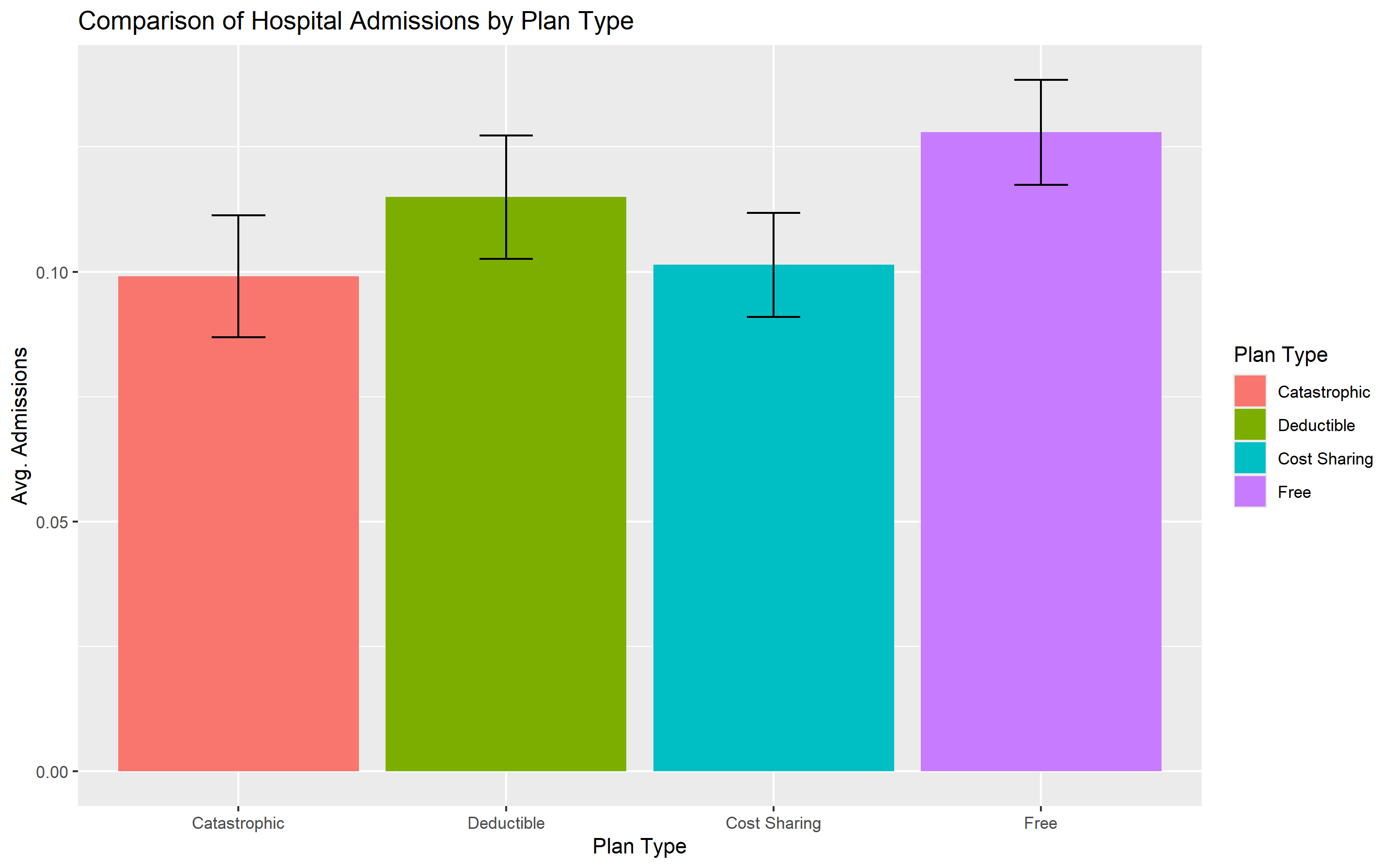
ggplot(rand_person_spend, aes(x = plantype, y = totadm, fill = factor(plantype))) +
stat_summary(fun.data = mean_cl_normal, geom = "bar", position = "dodge") +
stat_summary(fun.data = mean_cl_normal, geom = "errorbar", width = 0.2,
position = "dodge") +
labs(x = "Plan Type", y = "Avg. Admissions",
title = "Comparison of Hospital Admissions by Plan Type",
fill = "Plan Type")
Results
We can see from the graphs that there is a statistically significant difference in the mean number of admissions between the catastophic group when compared to the free and deductible group. However, there is no meaningful difference between the catastophic group and the cost-sharing group.
Implications
The findings align with the original RAND HIE results: individuals with free insurance tend to spend more on healthcare. This highlights how financial incentives can drive healthcare usage, a critical consideration for policymakers designing health insurance schemes.
Conclusion
The RAND HIE remains a landmark study in health economics. By using R to simulate and analyze key findings, we gain a deeper appreciation of its lessons. Want to try this analysis yourself? Check out the R script and explore further!